01 — The story
Every podcast. One page.
Podcast apps have turned into feeds. Open one and an algorithm decides what you should hear next, between rows of shelves you never asked for. podnod goes back to what people actually wanted: every show, on one page.
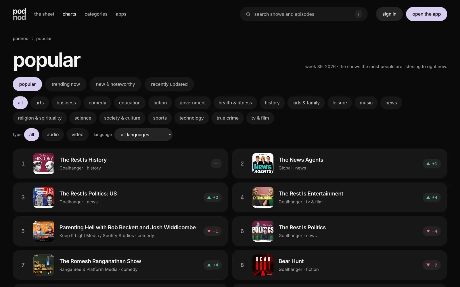
The sheet lays out more than 107,000 shows in a single view, refreshed every hour, with categories and weekly charts by listens and new subscribers. One player and one queue follow you from the web to macOS, Windows, Linux and Android, with iOS on the way. It remembers where you stopped without an account; signing in is only for sync. It is free, and it has no ads.
Free. No ads. No algorithm.
02 — The idea
No brand colour at all.
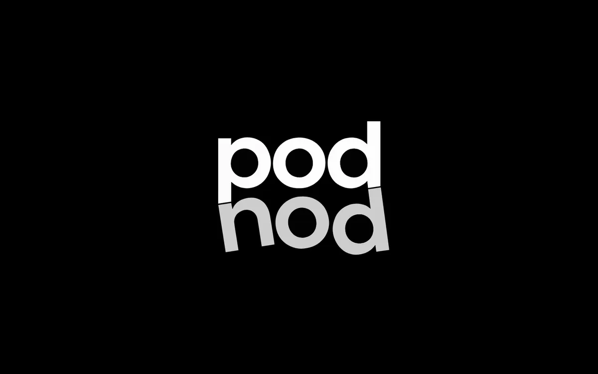
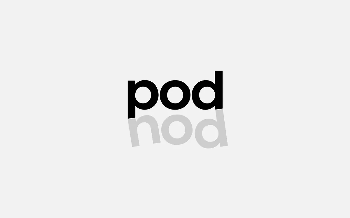
podnod is monochrome on purpose: black, white and greys, and not a single brand hue. The logo stacks pod over nod, the second word tilted slightly, like a head nodding along.
Inter carries every word, tracked tight. The only colour is a small accent tint each listener picks for themselves; the cover art does the rest.
Canvas
#000000
Paper
#FFFFFF
Blush tint
#F3CCCB
Sky tint
#C4DCF2
Butter tint
#F0E2AC
03 — Building it
One design system, everywhere.
Phone, desktop and web share one layout and one queue, and the app is dark by design so the covers do the talking.
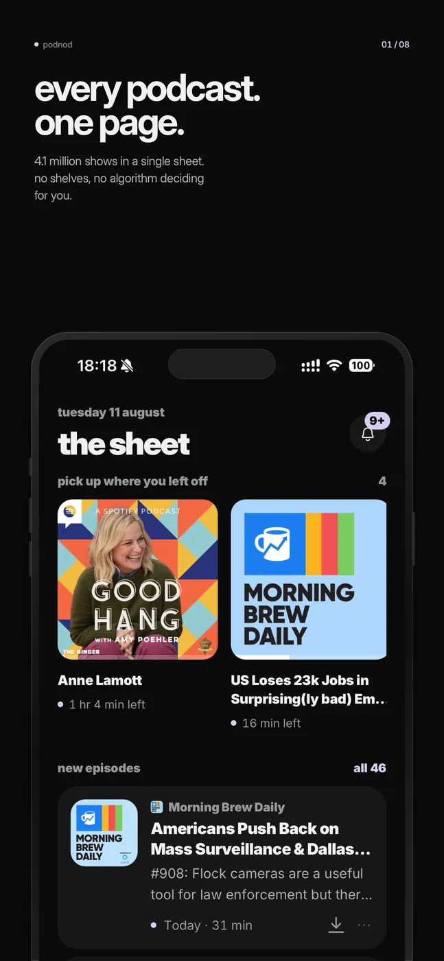
The sheet
Every new episode from every show you follow, on one page.
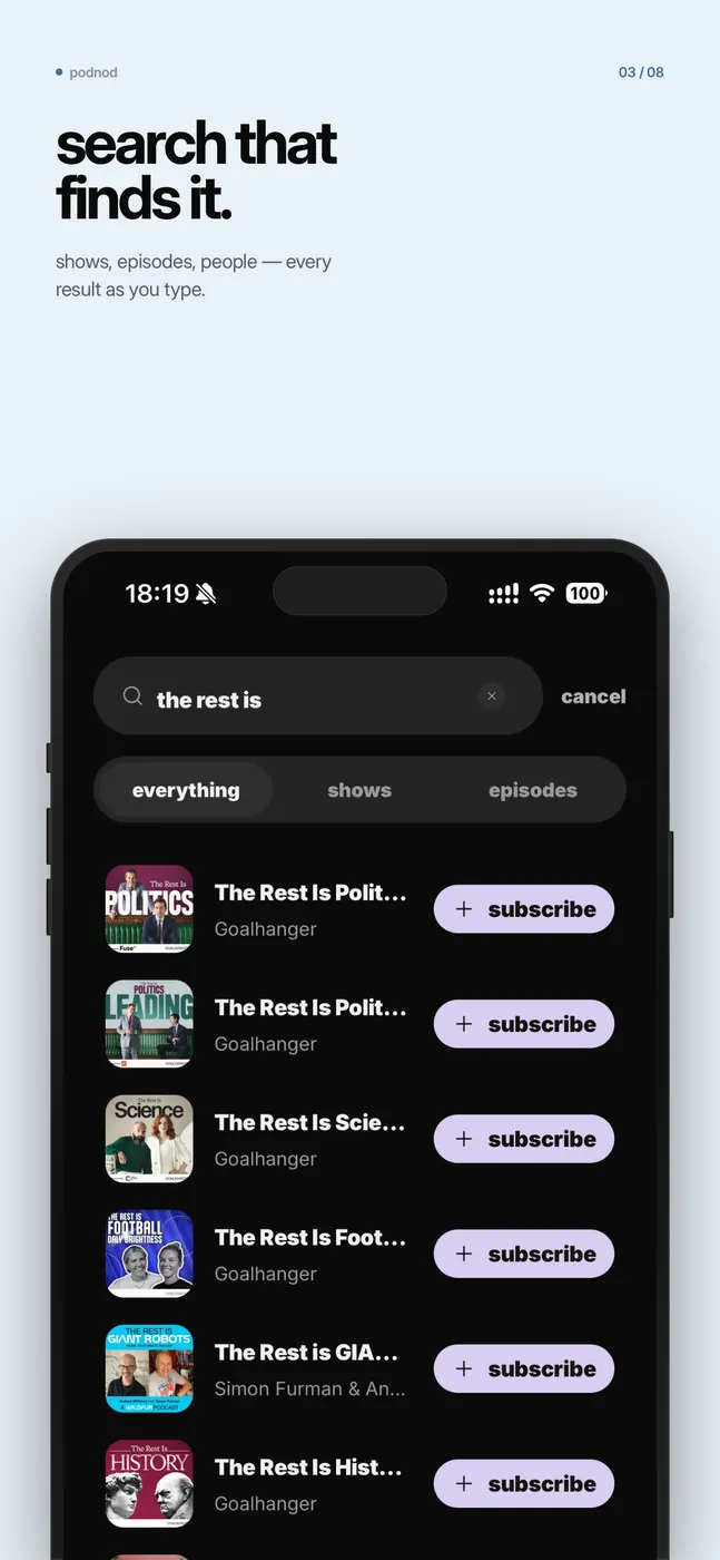
Search
Shows, episodes and people, found as you type.
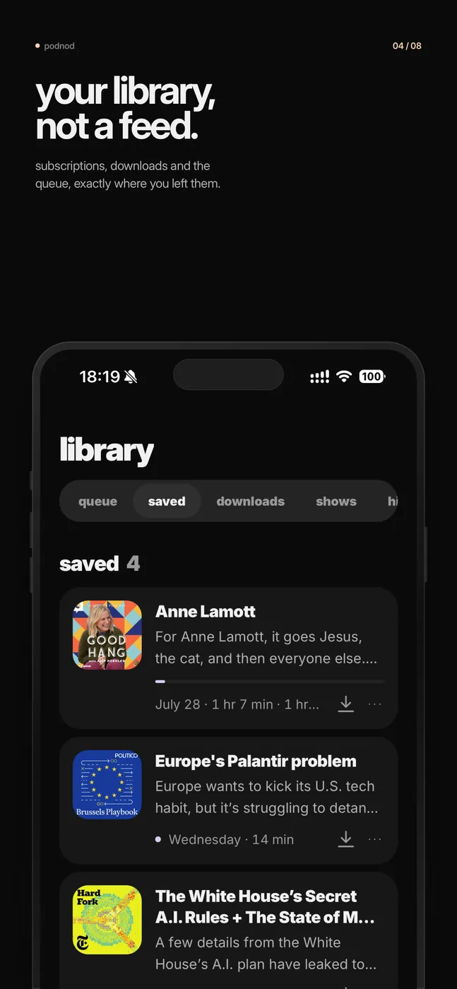
Library
Subscriptions, downloads and the queue, exactly where you left them.
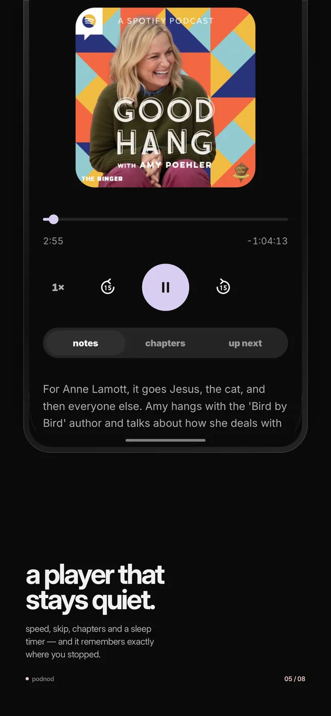
The player stays quiet
Speed, skip, chapters and a sleep timer, and it remembers where you stopped.
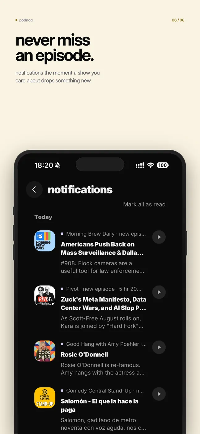
Notifications
A ping the moment a show you care about drops something new.
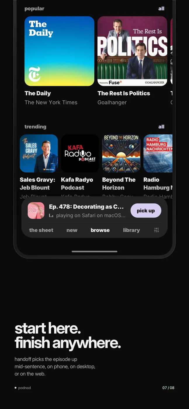
Handoff
Start on the phone and finish on the desktop or the web, mid-sentence.
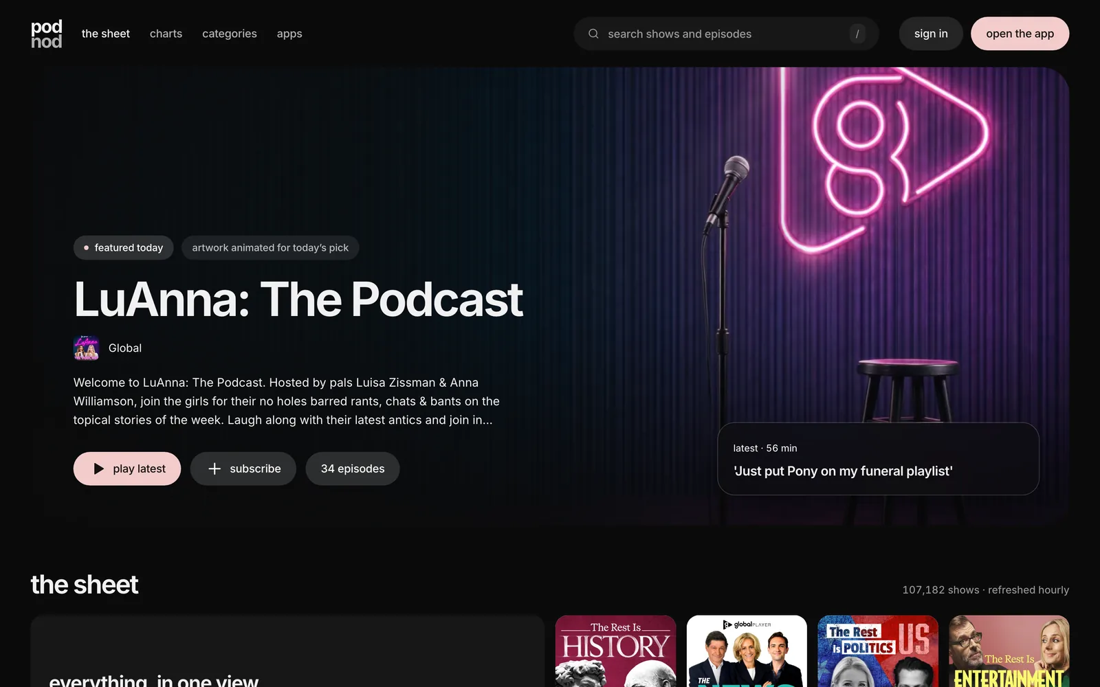
On the web the same sheet opens wide: a featured show up top, the whole catalogue underneath, and charts that update every week.
04 — Where it stands
Every show, every device, one queue.
More than 107,000 shows on the sheet, five platforms live with iOS on the way, and one queue that follows you across all of them.