
You might have noticed the paint. Every ink edge on this site grows drips that fill up, get heavy, stretch into a thread and let go, and so does every logo in the strip of brands we work for. The drops land on whatever is below them (a photo, a card, a button) and splat. On a flat top they sit still. On a tilted one they slide, spill over the edge, run down the side and drip on. It all ends up in a pool on top of the footer, which keeps rising for as long as you stay.
Our logo is a drip, so the website had to drip. Not a looping video: real paint, worked out live in your browser. It was built with Claude Code, as you’d hope from a studio that puts AI on the sign. Getting drips on screen was the easy part. Making them good enough to leave running on a live website was the real work, and that’s what this note is about.

Paint that knows where it is
Each drip is a small physics toy. Paint gathers in the bulb, the bulb gets heavier, and the heavier it gets the faster the drip runs on, until it necks down and lets go. A falling drop reads the real outline of whatever it hits, rounded corners and tilted photos included, so paint on a round button hugs the button. It feels the page too. Flick the page while scrolling and hanging drops shake loose. Hover a logo on the home page and it lifts, and the paint on it lifts with it.
Before any of it was allowed on the live site, it had to follow four rules:
- Never in the way. It can’t block a click, cover text or slow the page down.
- Still when asked. If your device asks for reduced motion, or JavaScript is off, you get the page at rest with the drips painted on.
- Flat paint. Crisp edges and the same little gloss as the logo. No blur, no gradients.
- Asleep when nothing moves.
Where it got tricky
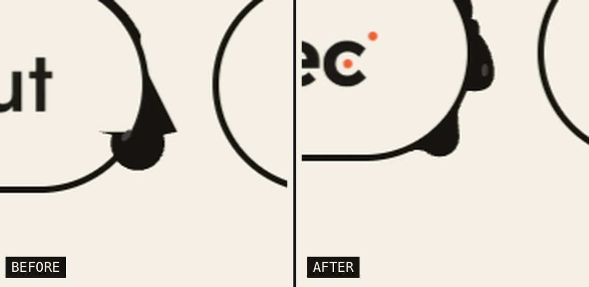
Round things, first of all. Most of those logos sit in pill-shaped buttons, and paint loves to creep around their round ends. That is exactly where the drips started growing sharp spikes, as if someone had trimmed them with scissors. The code that drew a hanging drop assumed the surface above it was flat. On the bottom of a pill, it is. On the curve, it drew a wedge up the slope and a sliver of paint across the button itself. The fix was to let the paint meet the real curve on both sides, the way a ball rolled in between the drop and the surface would touch both.
Then came the part where it nearly melted the browser. The longer you stayed, the heavier the page got. Paint piled up on every photo and card you scrolled past, and hovering a logo made the strip stutter. The first version followed an idea most developers would nod along to: draw the paint on lots of small canvases and redraw only the small bits that change. It turned out backwards. Every canvas costs the graphics chip something just for existing and being redrawn, however small it is, and after a long visit there were around 250 of them. Fewer, bigger canvases, and not painting what nobody can see, brought that down to about 80. In a test that scrolls the whole page and hovers a dozen logos, graphics work dropped by 39% and the long hitches went from eleven to one.
Measuring had its own trap. Our first reading said the page was dropping 19 frames every second. It wasn’t. The drips run at 60 frames a second on purpose, on a screen that refreshes 120 times a second, and the browser counted every frame we skipped as a failure. We could easily have spent a day optimising against that number. Check what a number means before you chase it.
A website can have a personality and still be fast. The trick is to treat the playful part with the same discipline as the boring parts: test it in a real browser, respect the people who don’t want motion, and keep it out of the way of whatever the visitor came to do.
Want your own website to feel a little more alive?